I immediately spotted this amazing set of 12 Holmegaard Ballon glasses, all in mint condition. They were designed by Per Lütken in 1973. I love the heavy, solid glass stem with the bubble and the very distinct 70s feel. This is the biggest size, they came in three different sizes, where each size was meant to serve several purposes. They go really well with Ruska, and they're perfect for almost everything. Aren't they gorgeous?
When I got back, I found this single glass in a different size and shape, but from the same series. Perfect for a cocktail or dessert. I'm hoping more of them will turn up!
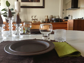
I have been collecting Ultima Thule for quite some time, but it's going
really slowly. If we are not more than the four of us, however, I have
enough tumblers. I prefer the Ultima Thule glasses without stems, so what do you experts out there say, can these two be combined (yesterday's dinner setting below) or are they too different? Please ignore that I couldn't be bothered to iron the placemats....

That first stall of the flea market had
so many gems. I found two pieces by Nils Aa Sivertsen, one from his time with Graveren (from 1949), the other one from the time he was employed by Stavangerflint. This first one is the Graveren piece, a candle holder. There was a number of products that had this lovely "gingerbread icing". Although I've never found when this pattern was designed, I will be very surprised if it wasn't in the 50s.


This is a Stavangerflint wall
plaque, the second piece by Nils Aa Sivertsen. The back says "Sweetheart" and that it's handmade. Isn't it cute? I must admit that if it wasn't brown,
it would probably be too cute for my taste... Sivertsen was employed by Stavangerflint in 1968, when Stavangerflint had just merged with Figgjo. He designed several patterns, like Florry, Amber, Bardu, Beito and Karin. I'm not familiar with these. He also designed some purely decorative pieces, amongst them the wall plaques, or relieffs "Mother" and "Wedding". I'm guessing the one I found must be from this series.
Yay!! My Wiinblad monthly plaque number thirteen! That doesn't add up, right? Well, I have two Januarys and two Februarys, but this is my first December, and now I'm only missing August.
The Figgjo
Hedda pattern was designed in 1977 by Rolf Frøyland. It was printed on pieces from the
Omega line by Ragnar Grimsrud and was in production until 1980. I like how the lid has more solid color and givs the piece some definition. I found some egg cups in this pattern earlier, that you can see
here.
And Daisy.... This is only my second piece, I found a
skillet a little while ago. I don't have much blue in my home, these are amongst the very few pieces that make the cut. There's something about that almost naive, happy pattern. I had dinner on it every day when I grew up, mum and dad had this and Tor Viking. Later they got Lotte, which they still use. Daisy was designed by Turi Gramstad Oliver, and was in production from 1969 to 1975.
This is my first Elvira piece! Elvira is a handpainted pattern, also one of the wonderful designs of mrs Oliver. It was in production from 1970 to 80. I learnt in the Figgjo museum this summer that the black was printed on, while the purple and brown was painted by hand. You can easily identify the brush strokes that adds to the handpainted feel. I think the pattern reflects the time it was designed so wonderfully. I cannot make out the "June design" on the stamp as I know for sure it was designed by Oliver. Does anyone know what this means?


I've never seen these next two plates before. Designed 18 years apart, they both feature a scene with one of our most famous writers, Alexander L. Kielland (1849 – 1906) who was one of the so-called "Four Greats" in Norwegian Litterature. You might have heard of the more internationally acclaimed Henrik Ibsen, he's one of them. In my Stavangerflint souvenir plates, Kielland is the sculpture on the market place, gazing towards the harbour in a cape and top hat.
Born in, you guessed it, Stavanger, he grew up in a rich merchant family. Kielland was the younger brother of our amazing female landscape painter Kitty Kielland. Despite being born into wealth, he had a sincere affection for the less fortunate, treating his workers well when he was a factory owner. He remained a spokesman for the weak and a critic of the hypocrisy of society throughout his time as a writer. I really enjoy reading his novels. They give such vivid images of the city at that time, with it's wharfs, fishery and canning industries that made the city before oil was discovered in the 1960s. Right now, I'm reading "Gift" (poison) which takes place in
my old high school. The descriptions of the building and the
cathedral next to it are so vivid, and it's so amazing to think that we attended that same school 100 years apart.
More familiar places, the first plate, decorated by Anders Jaarvik in 1968, shows him strolling in front of the medieval church at Orre, which you can see in a couple of my pictures
here. He called Orre "heaven on earth", and was often seen walking the beach there, which is a place I often visit too, have a look
here. His love of Orre was also said to have something to do with a woman... There's a stone next to the church, saying that this is the place he would have liked to be buried. However, when he died he was given a state funeral and a much more prominent burial site. To you Scandinavian readers there's a text on the back which is worth a read.


The second plate is much more recent, it was designed in 1986 and was one of the motifs in a series of ten designed by Henry Imsland for Lions Club. The style is more of a charicature and shows Kielland sitting in the garden of what could be the city house of the Kielland family. Unfortuneately, it was torn down many years ago and I'm not quite sure what it looked like. The family had another grand manor house which is still there and can be visited.
Kielland is said to have been quite a character, I can't resist showing you a couple of images. In the second one, he's posing with another of the "great four", Bjørnstjerne Bjørnson. Oh, the clothes of that time, aren't they magnificent? It seems like Kielland wore this kind of fez for informal occasions and at home, and wore a top hat when he strolled the streets.
My last Stavanger find is this piece of Sandnes pottery. I have mentioned them in several posts, and won't bore you with the details again:-) I was thrilled to find this particular one, you rarely find them in such good condition.
Finally (phew!!!), just a pic to show you some candles I recently found for my Festivos. I think it's really hard to find candles that fit them, but these aren't half bad! I dream of finding the original ball- shaped candles, does anyone know it they're still being produced? Wish you all a wonderful week!!!


