This weekend's thrifting certainly made me jolly! Or maybe ecstatic is the right word? I wasn't supposed to get myself anything, I was supposed to focus on my Christmas shopping list, but I just couldn't leave these treasures behind...
After work on Friday, I popped into the Fretex Salvation Army store where I found a set of three serving dishes in the Stavangerflint Brunette design from the 60s by artist Kåre Berven Fjeldsaa that I collect. I now have five of these in a wide range of sizes. I love this design, the pattern is so simple and refined and the color so great. I love how the edges get wider and turn into handles. The variation in color is created by the relief pattern. The smallest one originally made for sauce is my favorite, it has more of the gorgeous pattern than the larger dishes. I use it for Saturday sweets.


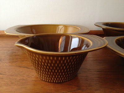
As you can see in the photo in the middle, the dishes have some variation in coloring, three of them are brown with a hint of olive, one is a bit greener, one a more golden brown. The Brunette line had a long production period, this can also be seen from the different stamps under them. The word "Ildfast", which can be found on a lot of Stavangerflint and Figgjo pieces means oven proof. I'm not sure what the word "Flamingo" refers to, I haven't seen this on the other pieces I own. The stamp on Figgjo pieces consist of the name of the brand and the spesific line (Folklore, Market etc), but I know Flamingo is not the name of this pattern. Anyone?


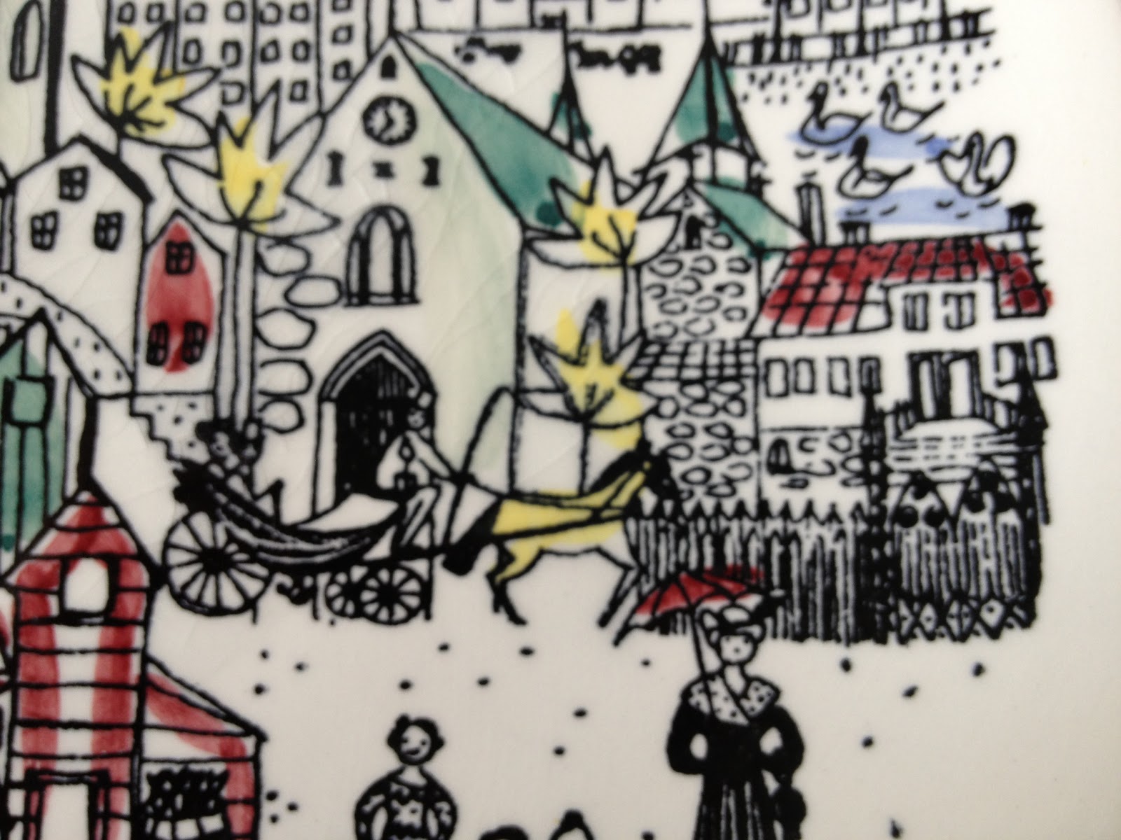
Next thing I found was this butter box in the August pattern from Figgjo. It's designed by the wonderful Turi Gramstad Oliver, who is the woman behind a great number of Figgjo designs, like Market, Lotte, Folklore etc. Her patterns are easily recognizable by their whimsical figures. All the Figgjo lines, even the newer ones, have these square butter boxes. This one is, unfortuneately, missing it's lid, but I couldn't leave it behind. I love this pattern, it has such a great 70s vibe. Maybe I'll use it as a small planter. It was in quite a sorry state when I found it, but after a good scrubbing, the white came out nice and bright.


One my way home, I stumbled upon a thrift store, or rather a warehouse, that I didn't know of. It's hidden away in an old industrial building and quite hard to spot if you don't know it's there. There was a large amount of clothing, glass, pottery, jewellry, books, old records and a lot more. There was a lot of really old stuff, but also quite a few mid century pieces in between. I immediately spotted a Stavangerflint brunette teapot that I've been looking for. And that wasn't the only thing....
I also found some Arabia Kaarna teapots, designed 1959- 60 by Ulla Procopé. This is the woman who also designed the Ruska line. The color is very similar to the Ruska, and the pattern has the same understated qualities. The Kaarna has horisontal lines that are slightly in relief and thereby a bit lighter than the background.
I found two more Hadeland heart ornaments in their original box from the 70s. I now have four hearts alltogether, a small bird and a larger one from this line. I feel so nerdy showing you the box, but I just couldn't resist! There's something about those images in the second photo that reminds me so much of Norway in the 70s.
Isn't this bird a cutie? It's a vintage piece from swedish manufacturer Eneryda glasbruk, I'm not sure of the production period. The body has color inside, while the head and tail are clear glass. The Eneryda birds came in different colors, I've seen a lot of blue ones on Etsy and Ebay, but I think it looks great in brown, it goes so well with the teak it's sitting on.
And finally- hold your breath - I found a large piece from the Hadeland Grønland line designed in the mid 50s by artist Arne Jon Jutrem. This is a piece I thought I'd never find. I'm so thrilled! My mom has a slightly smaller version and a bowl that was on our coffee table when I grew up. I think the set was a wedding gift, they got married in 1966.
The Grønland plate is such a beautiful and substantial piece. It's a full 35 centimeters (13,78 inches) wide and really heavy. It has all the beautiful qualities of a handmade piece, it's not completely circular and the edges are uneven. And don't even get me started on the bubbles.... This is the feature that really makes it stand out. Isn't it beautiful?
The lady who owns the store told me to collect the pieces I was interested in in a basket, then she would suggest a price. In an attempt on a little modesty, I decided on the Grønland plate, an Arabia Kaarna pot (she had three) and the Brunette pot. After she had told me the total (which was very reasonable), she threw in the smaller Kaarna pot, the two hadeland hearts she noticed I'd been looking at, the glass bird and the smaller Grønland plate for free!! Such a nice lady, I'll definitely come back. Great catch, huh? I'm still on cloud nine!