I’ve had a bit of a dry spell with the blogging lately. I could show you my newest thrifty acquisitions, but I thought I’d do something else this time and show you something that has inspired me immensely.
I'm usually all smiles (unless someone's done a good job at winding me up), but my taste and sense of aesthetics is more on the dark and gloomy side. I've always loved steel and the way it ages. There's something about the signs of lived life and the decay aspect that adds so much conceptually to a piece of art or architecture. Steel also makes me think of machines. Large machines in a landscape is a theme that's been a constant source of inspiration. In my student years I worked a lot with steel, often Cor Ten, a steel alloy that lets the surface rust quickly to form a protective layer. It won't rust through like regular industrial steel. When I designed a small pilgrim chapel once, my professor said: you know the Cor Ten steel might "bleed" down on the ground when it rains, don't you? He then thought about it for a few minutes (while I was thinking uh- oh) before he said: of course, let's hope it does, it's perfect for your concept!!
It's sad how few projects that allow for a purely conceptual approach, on a daily basis it's all about cost and deadlines and an enormous amount of paperwork. Sometimes I feel like I'm drying out as an architect and need to go back to the experimental student work, when it was ALL about concept and see if I can still get my mind into those tracks again.
Back to my source of inspiration. I've been immensely inspired by the photographs of canadian artist Edward Burtynsky, especially his series of photographs called Shipbreaking. If you’re not familiar with his work already, check out the website (quotes and images are courtesy of www.edwardburtynsky.com). He has documented manmade landscapes, landscapes that are shaped by industrial prosesses, like quarries, oil refineries, dams and mines. His photograps have so many layers. They can be seen as purely aesthetic, Burtynsky chooses to refrain from moralizing. He photographs civilization's materials and debris, but in a way people describe as "stunning" or "beautiful," and so, without words, raises all kinds of questions about ethics and aesthetics without trying to easily answer them. There's this strange feeling of guilt for finding them beautiful.
“The original idea for “Shipbreaking” started a long time ago. About four years after the Exxon Valdez oil spill I heard a radio program where they were talking about the danger of single-hulled ships. The insurance companies were refusing to cover them after 2004, which would force all these ships to be decommissioned. Only double-hulled ships would be allowed on the open sea to prevent that kind of catastrophe from happening again.
What went off in my mind was, wouldn’t it be interesting to see where these massive vessels will be taken apart. It would be a study of humanity and the skill it takes to dismantle these things. I looked upon the shipbreaking as the ultimate in recycling, in this case of the largest vessels ever made. It turned out that most of the dismantling was happening in India and Bangladesh so that's where I went.”
I'm usually all smiles (unless someone's done a good job at winding me up), but my taste and sense of aesthetics is more on the dark and gloomy side. I've always loved steel and the way it ages. There's something about the signs of lived life and the decay aspect that adds so much conceptually to a piece of art or architecture. Steel also makes me think of machines. Large machines in a landscape is a theme that's been a constant source of inspiration. In my student years I worked a lot with steel, often Cor Ten, a steel alloy that lets the surface rust quickly to form a protective layer. It won't rust through like regular industrial steel. When I designed a small pilgrim chapel once, my professor said: you know the Cor Ten steel might "bleed" down on the ground when it rains, don't you? He then thought about it for a few minutes (while I was thinking uh- oh) before he said: of course, let's hope it does, it's perfect for your concept!!
It's sad how few projects that allow for a purely conceptual approach, on a daily basis it's all about cost and deadlines and an enormous amount of paperwork. Sometimes I feel like I'm drying out as an architect and need to go back to the experimental student work, when it was ALL about concept and see if I can still get my mind into those tracks again.
Back to my source of inspiration. I've been immensely inspired by the photographs of canadian artist Edward Burtynsky, especially his series of photographs called Shipbreaking. If you’re not familiar with his work already, check out the website (quotes and images are courtesy of www.edwardburtynsky.com). He has documented manmade landscapes, landscapes that are shaped by industrial prosesses, like quarries, oil refineries, dams and mines. His photograps have so many layers. They can be seen as purely aesthetic, Burtynsky chooses to refrain from moralizing. He photographs civilization's materials and debris, but in a way people describe as "stunning" or "beautiful," and so, without words, raises all kinds of questions about ethics and aesthetics without trying to easily answer them. There's this strange feeling of guilt for finding them beautiful.
“The original idea for “Shipbreaking” started a long time ago. About four years after the Exxon Valdez oil spill I heard a radio program where they were talking about the danger of single-hulled ships. The insurance companies were refusing to cover them after 2004, which would force all these ships to be decommissioned. Only double-hulled ships would be allowed on the open sea to prevent that kind of catastrophe from happening again.
What went off in my mind was, wouldn’t it be interesting to see where these massive vessels will be taken apart. It would be a study of humanity and the skill it takes to dismantle these things. I looked upon the shipbreaking as the ultimate in recycling, in this case of the largest vessels ever made. It turned out that most of the dismantling was happening in India and Bangladesh so that's where I went.”
Until the end of 1900, shipbreaking took place in industrialized countries, such as Great Britain and the US. Today, the industry has moved to Pakistan, Bangladesh and India due to cheaper labour, less restrictive laws concerning handling of hazardous waste, and no great risk of legal claims for injuries or health problems. There is hardly any basic protective gear, like helmets, gloves or masks being used in the demolition, it’s man (even children) against giant supertanker, barefoot in steel shrapnel and chemical waste.
The ships are dismantled, and even the smallest steel component is sold. Only tiny fragments are left after dismantling a supertanker, the industry supplies 80 percent of the steel resources of Bangladesh. It has become a valuable source of income that sadly comes with a very high price.
The stranded giants, partly taken apart, look quite surreal, unlike anything you’ve ever seen, like a scene from Dante’s Inferno. They are robbed of their dignity as ships, but are still impressive due to their overwhelming size. You can see elements you’ve never seen before, rare views of inner constructions. Nothing has ever amazed and inspired me more.
The ships are dismantled, and even the smallest steel component is sold. Only tiny fragments are left after dismantling a supertanker, the industry supplies 80 percent of the steel resources of Bangladesh. It has become a valuable source of income that sadly comes with a very high price.
The stranded giants, partly taken apart, look quite surreal, unlike anything you’ve ever seen, like a scene from Dante’s Inferno. They are robbed of their dignity as ships, but are still impressive due to their overwhelming size. You can see elements you’ve never seen before, rare views of inner constructions. Nothing has ever amazed and inspired me more.


To see beauty in destruction is a strange phenomenon. Nature transformed by industry is a common theme in Burtynsky’s work, places most of us don’t experience, but on a daily basis contribute to the upkeep of. The photographs reflect the dark side of our consumer society, but the artist’s aesthetic fascination for these manufactured landscapes shines through. He says of his work:
“These images are meant as metaphors to the dilemma of our modern existence; they search for a dialogue between attraction and repulsion, seduction and fear. We are drawn by desire - a chance at good living, yet we are consciously or unconsciously aware that the world is suffering for our success. Our dependence on nature to provide the materials for our consumption and our concern for the health of our planet sets us into an uneasy contradiction. For me, these images function as reflecting pools of our times."
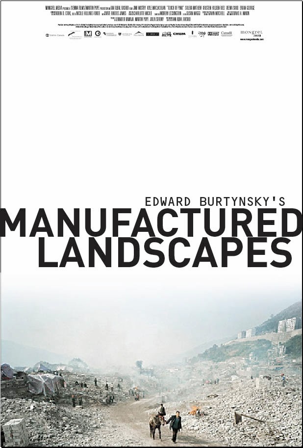
The documentary “Manufactured landscapes” (Jennifer Baichwal, 2006) documents Burtynsky’s travels to several areas transformed by industrial prosesses and we see him at work. I cannot recommend it strongly enough.
Below, I've thrown in some samplers of my more abstract wrecks from my student days. Picture 2 to 5 are from a course that was purely experimental. We
spent half of the semester wondering what the heck we were doing, until
we discovered that was exactly the point. All our strange models were
discussed very academically, it was REALLY interesting. I can't even
remember how I described the purpose of my "machine" placed in the
transition zone between land and ocean, I think our sensors read more
into it than I had the brains to come up with... (pic number 5 of the sensor team of guest professors was taken by a friend) Although a bit
frustrating, this research course led me to the idea for my diploma.


The following images are from my diploma, where I designed a wave
powerplant from a different strategy than the usual one, where the
landscape is completely ruined. It consisted of several "machines", each
fitted into natural gaps in the landscape and orientated according to
the wave power potential. I chose my topic out of the shock of discovering that no landscape conciderations whatsoever were made in the planning of a test plant on the most beautiful island imaginable. I'm a firm believer in renewal energy, but in my country much of the resistance towards it is much due to landscape preservation. The installations leave permanent scars, while the technology is constantly being developed and they thereby have a relatively short lifespan on the site. I think a lot of effort needs to be put into the design and approach to the sites, minimizing the negative impact.


The site is very rocky and torn up, and I worked with the idea of seeing the power plant as a wreck being pushed into the gaps in the landscape by the force of the waves. I tried to examine how a shipwreck would hit land and where it would end up. I divided the powerplant into several individual “machines” that could be orientated according to the wave power potential. The company that was planning the test plant kindly gave me a lot of information and test results on the wave potential. Of course, I didn't tell them I was doing the project as a critique of their approach....
A wreck comes to rest on shore in a seemingly accidental way, but it is in fact a result of the topography and the force that pushed it there. It’s something man can't control or achieve, that's what makes it so fascinating. It is usually partly crushed in it’s violent encounter with the landscape. This produces asymmetry, strange angles and views of the inner spaces and constructions that are not usually seen. There’s a wreck on my favorite stretch of coast that I’ve often photographed, for my diploma I used some of them to illustrate my concept.
A wreck comes to rest on shore in a seemingly accidental way, but it is in fact a result of the topography and the force that pushed it there. It’s something man can't control or achieve, that's what makes it so fascinating. It is usually partly crushed in it’s violent encounter with the landscape. This produces asymmetry, strange angles and views of the inner spaces and constructions that are not usually seen. There’s a wreck on my favorite stretch of coast that I’ve often photographed, for my diploma I used some of them to illustrate my concept.


Engineers helped me with some structural challenges, since they were a bit more "hardcore" than the usual building technology we’re expected to master, offshore construction and all. Through the whole semester I was so nervous about how the team of sensors would see it, it was the first time a power plant was designed in my school. Luckily, it all went very well.
Wow, you must be exhausted by now if you've made it to the end of this post!! I promise I'll be more cheerful next time:-)