Showing posts with label modernism. Show all posts

Monday, September 30, 2013

70s jewellery - Jorma Laine

I've been admiring jewellery from the 70s for a long time, especially the work of Guy Vidal, Robert Larin, Pentti Sarpaneva and Jorma Laine. I especially love the brutalist pieces. Turns out I have a brooch by Jorma Laine! My mom reminded me last weekend. I've actually had it since I was in my teens. I got it as a gift from some much older cousins, but hated it back then. You know, the early 80s and all... If you're around my age, you're probably nodding! But isn't it great how we mature and learn to appreciate things? The brooch is made of bronze, then gold plated and oxidized. It was designed in the mid 70s. I'm normally a silver and steel person, jewellery- wise, but I think this has some nice folkloristic vibes and I'm glad to having rediscovered it. Those may be the same qualities I hated it for in the early eighties...

Jorma Laine (1930-2002) was a finnish jewelry designer, whose work in bronze and silver is easily recognizable. He developed a style of his own throughout the 60's and 70's, his pieces are very modernistic and often abstract. I see a lot of influences in my brooch, there's mythology, ancient times, bronze age, even some viking vibes! I love when a piece of design, even if very abstract, can produce all those images.

Laine attended the renowned art college Turun Piirustuskoulu (Turku Art School). During his career he had his own company, Silver-Laine, but is perhaps best known for the designs he did for Turun Hopea. He also designed silver jewelry for Kultateollisuus. Laine is known for his forward-thinking modernist impulse, a decidedly “Finnish” nostalgia for the past, and individuality. After a successfull career in jewelry design, he retired to his cabin in the forest where he led a hermitlike life until he died of a heart attack in 2002, 72 years old.

Photographing the brooch was so much fun, it's like a sculpture, so here you have it from every angle:-)


MMMC challenged me over at Instagram to show it on. Well, I wore it to work today as a "button" on an otherwise button- less black jacket, with jeans and black boots, so this is for you, Carmel!


Sunday, March 17, 2013

Thriftin' weekend


I found some great pieces this weekend. It's funny, it was one of those weekends when you think not much will happen, thrifting wise, but then it turns out to be quite the opposite. Even at my oldest son's soccer game in a neighbouring city, I stumbled upon a thift store when I went to get some take away coffee with some of the other parents.

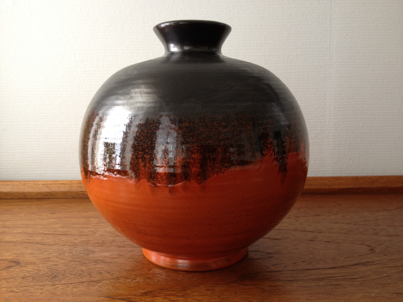
I think my favorite finds in this post are the two pieces of orange and brown pottery. Believe it or not, I actually didn't notice before I got home what a perfect pair they make! The bowl is a Scheurich, the vase is made by Ekeby, Sweden. I don't know a great deal about swedish pottery, but I've seen a lot of pieces marked Uppsala Ekeby, there might have been a merger of two companies at some point. Pieces og information will be greatly appreciated! Anyway, I really love them, the colors are magnificent, as is both texture and pattern. 


I really love Arabia Ruska. It's so rustic and the texture, the gorgeous effect of the different shades of brown and the almost metallic surface, is amazing. I was so thrilled when I found this large serving plate and lidded dish. I guess most of you already know the facts about this great Ulla Procope- design, but it never seizes to amaze me that it was designed as early as  during her time with Arabia from 1948- 68. If I didn't know, I would easily have guessed the 70s. Does anyone know the exact year? It was, deservingly, in production for a long time, I'm guessing much due to it's modern and rustic appeal.


I lived in Belgium for a period of time back in the 80s. I was in my mid- teens and had the greatest time there. I still have a soft spot for anything Belgian. I remember Marbell Stone Art Belgium, my mom bought a couple of pieces before we moved back to Norway. They're made of sandstone and have a lovely porous surface. The pieces very from figurative to abstract, I prefer the abstract ones, they have a bit of a modernist vibe. There's very little to be found on the web about the company, I wonder if they're still at it? Does anyone know? I instantly fell for this one when I saw her in the window of a local thrift, she's a bit "Henry Moore- ish", isn't she gorgeous?


I found two more great Scheurich pieces. The light brown one is in a pattern called "Koralle" (Coral). I managed to dig up from the web that it was designed in the 60s by A. Seide. The color has a little bit of a greenish yellow mixed with the brown, it's quite an appealing color, but a bit too peculiar to blend in with other browns easily. It looks good with the reds, though. The new red one is really shiny, and has found it's place with my other red- themed Scheurich pieces and my 60s red ceramic lamp. I don't yet  know the name of this pattern, but I'll keep digging.


I found a Haldensleben piece that I already have, but couldn't leave behind. It's one of my favorite WG pieces, and what if it'll break one day... My husband now calls me the hamster, I wonder why?


Finally, I found this really cute little Stavangerflint sugar bowl in sea green and cream. I don't know what this pattern is called, if anyone of you out there knows, please drop me a line! I'm quite sure it must be early 60s or 50s, the shape resembles their earlier production. I love the delicate leaf pattern!


Sunday, February 03, 2013

More great norwegian modernism

Yesterday, the weather was so great here, I went for a walk around a nearby university campus that has a great park with a pond (now frozen!) and a nice mixture of buildings from different periods. The one that always catches my eye is this one, the Auditorium Maximum, by architect Leif Olav Moen. It was the winner of a competition for a new auditorium and assembly hall. Construction started in 1969 and it opened officially in 1970. I find it a typical example of late modernism, there's a bit of brutalism as well as structuralism going on. One of the things I love about it is that although it seems uncompromising at first glance, great conciderations has been taken to the shape and character of the landscape. There's a strong connection between the two. I love architecture that showcases the structural elements like this, in that way great expression is achieved without excess elements. I guess this is why my all time favorite is Mies van der Rohe, he turned construction into poetry.

In front of the building is a great piece of art by norwegian artist Carl Nesjar, who represents the experimental modernist tradition. He has achieved great fame internationally for his collaborations with Picasso. The duo worked together both in Spain and in Norway, and as a result, we have a few great sculptures here. This one, however, Nesjar did on his own. he had a strong technical interest, and experimented with freezing and cooling techniques that would make his steel sculptures change with the seasons. This sculpture originally sprayed water, gas and mist. I've never seen it "in action", it might not be working anymore. I've seen photos of it all covered in ice, it's quite spectacular.


Saturday, November 17, 2012

Amazing norwegian modernism

This is gonna be a long one, please bear with me.... What I'm gonna show you today not only makes my heart beat faster, it makes it pound like crazy.

As an architect I never stop being amazed by modernism. I can't think of any other era as groundbreaking as modernism, when the whole concept of living and how we percieve our surroundings were so profoundly reinvented. Imagine how brave these architects were, even today it's often hard to convince clients to have an open mind.

Today, lots of houses copy the style of the houses from this great era, but in my opinion, seem to copy the aesthetics but leave out the invention and meaning. The mid- century architects, that we all love and admire, wouldn't want us to copy what they did, but to keep on reinventing. We should be inspired by the bravery rather than the style, keep on preserving modernist buildings as great examples of the extremes the architects  went to to contribute to the evolution of the field of architecture.


We have one of these great examples in Oslo. Planetveien 12 (12, Planet lane, even the adress points to the innovative space age ideas of the time) was designed by one of our greatest modernist architects, Arne Korsmo, as a home for himself and his wife Grete Prytz Kittelsen. You may recognize her name, she is the lady behind the iconic lotus design for Cathrineholm that we all know and cherish. She was a great artist and designer whose beautiful objects can be found throughout the house, as well as the work by their close friend, great modernist artist Gunnar S. Gundersen. The house is an example of the modernist idea of the "gesamtkunstwerk" (the complete work of art, Bauhaus), the merging of different art forms, like architecture, furniture, objects and art.


Korsmo made a great contribution to the Scandinavian Design movement and introduced the field of indusrial design in Norway. He is well known for his elegent tableware. His intention was always to design both the exterior and interior of his houses, and often the furniture and tableware too, just like his nordic colleagues Arne Jacobsen and Alvar Aalto did.

The house is one of three (originally) identical houses in a row. Korsmo and Prytz Kittelsen lived in the middle of the three. The houses have received a lot of international attention. Not only did they introduce the international principles for glass and steel architecture in Norway (as seen in, amongst others, Mies van der Rohe's great buildings), they were also a manifest for a new, modern and flexible way of living.


In collaboration with his colleague Christian Nordberg- Schulz, Korsmo designed the three modernist "experiments", as they called them, where they explored new ways of living. Korsmo's home was by far the most radical. Togethet with his wife he cfreated a home that reflected modern life with it's floating boundaries between work and leisure as well a s the public and the private.

The street facade is made of translucent Thermolux panels. This was very unusual at the time and is very rarely seen even today. On the sheltered garden side, the house is extremely, and in 1954, shockingly transparent.

Planetveien 12 is an experiment with standard elements and modules, much like the house of Korsmo and Prytz Kittelsen's american friends, Charles and Ray Eames. The house was inspired by both the Case study project (if you don't already know it, google it- these houses are as groundbreaking as they are gorgeous) and japanese architecture. It was a product of Korsmo's ideas of an organic and flexible way of living, the home mecano, as he called it. His home is on a list of twelve buildings which are considered the most important buildings of post- war Norway. It managed to put norwegian modernism on the world map and inspired the structuralism of the sixties.

The interior from 1954 is kept in it's original condition. Both the exterior and the interior has been protected by law after Prytz Kittelsen died two years ago. She very much contributed to how the house turned out, it was her home and workplace for more than fifty years.

To Korsmo and Prytz Kittelsen, a home was just as much a place to work as to relax and entertain. Planetveien 12 was a flexible home that answered to the modern individual's need for relaxation, work and social life. The stair to the second floorhad an engine and could be lifted when more floor space was needed for dancing and the stairs down to the basement could be hidden away. The main space, which is an untraditional combination of living room, workspace and entertaining area, has a large seating arrangement that consists of 100 square cushions that runs along the walls and can be transformed into an amphitheatre for performances. The white panels over the fireplace can be turned to become blackboards for creative spells and there is storage behind every surface. One of the living room walls is made of tall panels that can be reversed to give the objects on display another background color. Legendary silver and enamel pieces by Prytz Kittelsen are on the shelves.

 
The rest of the house was equally flexible. The arrangement of plywood modules in the kitchen could easily transform the space from informal everyday kitchen to dining area or workspace. I used to think the surfaces were made of teak veneer, but they're actually mahogany. The beds upstairs could be folded away to extend the floor space. 


The creative couple were friends with Utzon and Aalto, who visited the house regularly. It is said that Prytz Kittelsen was such a great hostess that Aalto always insisted on being seated next to her. Prytz Kittelsen got the "work home" she wanted. She had her workshop in the basement, where her lovely portrait was taken by Vogue in 1961. The large oven for her enamelware is still there. This is where she designed all the enamel objects, silverware and jewellry that made her one of Norways greatest post- war designers. She divorced Korsmo, who died in the late sixties, but continued living in the home they created until she passed away two years ago.

Prytz Kittelsen never stopped loving the house with all the objects the couple filled it with. "I have always loved it here at the edge of the woods, I've cherished every day I can just be here. The light, the colors, the rooms, I never tire of it."
In her last will, Prytz Kittelsen wanted the house to be lived in, instead of becoming a museum. It was sold after her death. The house is protected by law, which means that no alterations of the exterior or interior can be made, this also applies to the furniture. I'm really envious with the couple who bought it, I hope they love it as much as I do... 
Related Posts Plugin for WordPress, Blogger...