Sunday, September 16, 2012

New shade for my Søholm lamp

I'm still extatic about my new Søholm ceramic lamp. This weekend I bought a new lampshade for it, here's how that turned out. I think the width looks good, but I'm still a bit unsure about the height of the shade, maybe it should have been a bit higher. Any thoughts?

 
Thanks to you guys out there writing informative entrys about danish pottery (retropottery.net and 20thcenturyforum.com), I've worked out the monogram EJ under the base, which is almost in the shape of an eye. This means that my lamp was made by artist Einar Johansen, who was active at Søholm from 1958- 68, I'm guessing it was made in the late sixties.


Anish Kapoor

Thought I'd follow up my last entry. On my trip to Chicago, I also checked out the sculpture/ spatial installation "Cloud gate" by Anish Kapoor. This is something completely different from Calder. Kapoor has several other works where he investigates the effect of turning the surroundings upside- down with the help of an object with a reflecting surface, and thereby twisting and questioning how we perceive them.

 
It's a great experience to observe how people act when exploring this artwork, it's the same behaviour you see in front of these strange fairground mirrors that distort reality. Spatial artworks like this, that you can move around in really invite you to become part of them, and are "activated" when you do, it's a great thing. Apart from the experience, the perfection of the chromed steel surface is just amazing...
Kapoor has a great website, check it out here.


Saturday, September 08, 2012

You gotta love Calder

I love art, especially sculpture. I love the great modernist pieces, and also pieces from the sixties and seventies and up until now, like Alexander Calder, Antony Caro, Donald Judd and Anish Kapoor. To name a few...
 
A couple of years ago, when I visited Chicago, I went to see the Alexander Calder Flamingo sculpture (1973) on Federal plaza. It's an amazing piece of art. Flanked by the gorgeous and serene black glass and steel buildings by Mies van der Rohe (another great favorite), the sculpture is like a rebellion, a giant bright red explosion in the middle of the plaza. Calder gave the stabile its color, which has come to be called "Calder red", to offset it from the black and steel surroundings.  
 
The stabile is an art form which Calder pioneered. It is an abstract structure that is completely stationary, as opposed to a mobile, which can move with air currents. You've probably seen his mobiles? If you haven't, check them out, they're great.
 
Calder was commissioned to design the sculpture because the space, surrounded by rectangular modern buildings, needed the kind of arching forms and dynamic surfaces that a large-scale Calder stabile could provide.
 
Calder unveiled the model for Flamingo on April 23, 1973 at the Art Institute of Chicago, the sculpture was presented to the public for the first time on October 25, 1974, at the same time that his Universe mobile was unveiled at what was then known as the Sears Tower.
 
Calder's structure is a prominent example of the constructivist movement, first popularized in Russia in the early 20th century. Constructivism refers to sculpture that is made from smaller pieces which are joined together.


Finally a great picture of Calder in his studio, (from the book Calder by Jacob Baal- Teshuva) surrounded by his amazing mobiles and stabiles. What a guy!
 

Can't believe my luck

I was so thrilled when I found this gorgeous vintage Søholm lamp today on my ritual Saturday thrifting. I've been lusting for one of these beauties for a long time, and just when I was about to leave the shop, there it was! And the price, you ask? 75 kroner ($13)!!! Bless the Salvation Army...
 
The pattern on the base is in a delicious golden brown with some grey- bluish accents. I have to find a nice lampshade that will do it justice. I'll show you when I find one. The colors go so well with a piece of artwork that I have by norwegian artist Ørnulf Opdahl, see?


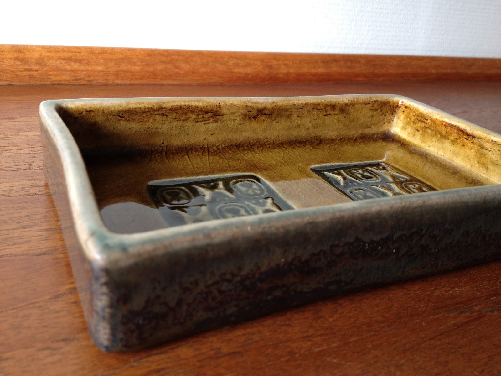
I found another great piece of Danish studio pottery too, this lovely rectangular ceramic dish, marked "COB Studios Danmark 28-20". Does anyone know anything about this studio? The dish has a beautiful glaze in a mustardy color with a hint of greyish blue tones on the sides.


Finally, I found some West German pottery, a Scheurich vase in neutral toned lava glaze. I will be looking for some companions for this, I think they look nice in a group of pieces with similar colors.


Monday, September 03, 2012

Ultima Thule by Tapio Wirkkola

I just had to go back to the charity store after work today to see if the Ultima Thule dessert bowls were still there, I've thought about them since Saturday, regretting leaving them behind. What was I thinking?? There might have been a few more on Saturday, but I'm pleased that I'm now the proud owner of a set of four. They set me back only 100 kroner, the equivalent to $17 or £10,80. That's great design at a great price, supporting a great cause.

Tapio Wirkkola designed these beauties in the 1960s, inspired by melting ice. Aren't they gorgeous? They truly look like they're made of ice.
They seem to float above the surface, touching the ground only by three icicles. When the sun shines through them, the glass looks like melting ice. Amazing... 


Saturday, September 01, 2012

Small treasures

My mom just gave me these wonderful teak coasters they bought when they lived in India in the sixties. They have great sentimental value, I remember I used to play with them as a child. To the right is a little wooden box my husband bought for me on a worktrip to India a few years ago. It's wonderfully smooth and well crafted, and I think it might be rosewood.
 
I've paired these objects with my no- nonsense IKEA- lamp, I think they make a nice little trio of related rounded shapes.


Catch of the day

On Saturdays I have this little ritual of popping by my local thrift shops to have a quick look before doing the weekend grocery shopping or whatever else that needs to be done.

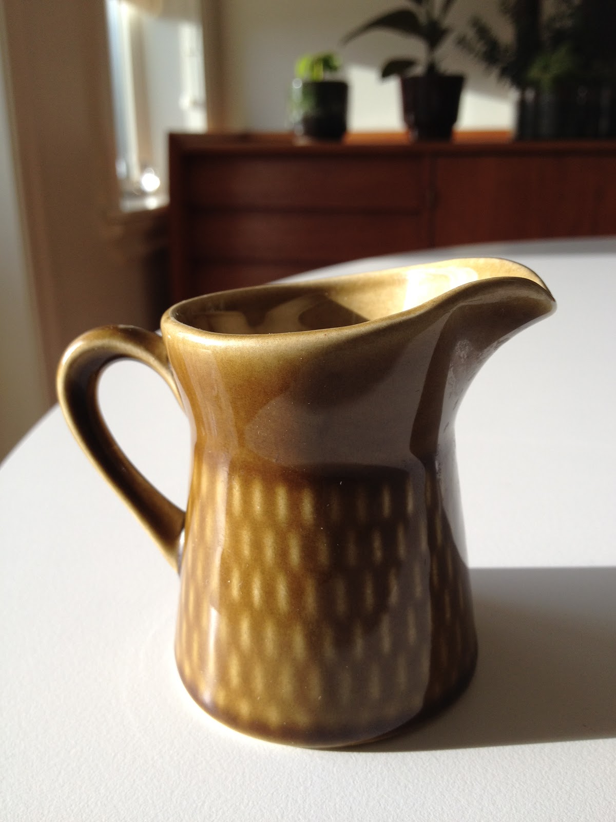
Today I found this cute little creamer from the "Brunette"- line by Stavangerflint in olive green. Hopefully the sugar bowl will turn up some day. I also found a tureen in the same pattern, but in brown with a beige lid. "Brunette", designed by  Kåre Berven Fjeldsaa came in three colors, olive, brown and beige, that you could combine. See also my entry about other Brunette- items here.

I also saw a full set of Ultima Thule dessert bowls by Tapio Wirkkola that I'm starting to regret not getting. I might pop in on Monday to see if they're still there....


A tribute to Herman Hebler

I recently stumbled upon this book that I bought at an art exibition some years ago, a retrospective by norwegian graphic artist Herman Hebler. If you don't already know this great artist, you're in for a treat.
He was actually there at the exibition at the age of 95, and I was lucky enough to get my book signed by him. Sadly he died the year after, but he has left behind a great legacy.
 
Hebler was born in 1911 in Fredrikstad, where he lived and worked most of his life. He studied art in the thirties, influenced by thirties modernism and the emerging nonfigurative artforms.
 
Today, he is considered one of the most consequent nonfigurative constructivists, both in Norway and internationally. His artwork is anchored in modernism, it's avantgarde, but also has an academic side. He explored the geometric shapes, the circle, the square and the triangle. The clean plains and sharp lines of his silkscreens are characteristic for his work. Heblers work has since the fifties been abstract, and has since the sixties been more and more concentrated on large, simple geometric shapes.
 
Herman Hebler was one of the pioneers of the silkscreen technique in Norway and is the founder of the international Graphic art biennale (now triennale) in Fredrikstad, his home town. I love the work of this great artist. In real life and original scale, the artwork is so intense, the hypnotic quality of the color and pattern sucks you in. And it's a great place to be....

 
Look at the murals ot the top left and middle right, aren't they gorgeous? I'd love to find out where they are and if they can be seen. I'll let you know!


Images from the book "Retrospective - Exhibition 1936 - 2006, paintings - graphics - drawings - objects"
 
Check out this link for more about this great artist.
 
Related Posts Plugin for WordPress, Blogger...